 We’ve talked about responsive web design in general, and responsive design for mobile devices. Now we’re thrilled to tell you that HubSpot supports responsive web design for your website and blog!Responsive web design very simply responds to different-sized devices with a design appropriate for that size. So while users are at the same web page, they may see things a little differently on their desktop, tablet (landscape or portrait) or mobile phone.
Pew Research reports on the proliferation of non-desktop internet users:
Some 88% of U.S. adults own a cell phone of some kind as of April 2012, and more than half of these cell owners (55%) use their phone to go online. Moreover, 31% of these current cell internet users say that they mostly go online using their cell phone, and not using some other device such as a desktop or laptop computer.
Caveat: check your own web stats to see how many visitors you’re getting from mobile device. Right now, our mobile traffic is 11.3% of our overall traffic. However, that’s three times more mobile traffic that we were seeing a year ago (at just under 4%)!
The good news is that we just completed a simple “micro-site” project for a client, where they wanted the 1-page website to work on all devices. We helped them accomplish this, and now are building 100% responsive websites and blogs right in HubSpot!
And yes, our own website is the next candidate for this “makeover” — somewhere in-between other projects!
The TFAdaptive 1-page micro-site was instructive for us. They had already built the website and wanted it to “go mobile,” had only 5 days for a big conference where they were announcing the new product.
After a little experimentation, we determined that the best way to do this given the time constraints, was to use a separate mobile platform and develop the site on that platform.
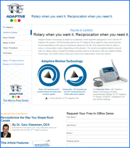
As you can see, the sites are different, but very similar.
Our client at Sybron Dental liked the mobile site and the quick turnaround, so they gave us another project with a longer time frame and a challenge: “Make this a 100% responsive website.”
100% responsive web design in HubSpot
Here’s where it got fun! We selected Skeleton as our code base for the project. Skeleton is a small collection of CSS files that can help you rapidly develop sites that look beautiful at any size, be it a 17″ laptop screen or an iPhone. Skeleton is built on three core principles:
- Responsive grid design down to small mobile platforms
- Rapid development – very easy to code
- Style agnostic – complete freedom for our designers
We built a quick demo site to prove to ourselves we could do this in HubSpot. Our test site worked great on all sizes of devices, and on Android, iOS, and Windows8.
Then we looked at each other in amazement — why aren’t we using this for all our HubSpot clients?
We called a few clients, and now each of the marketers we called has added a HubSpot site make-over using responsive design into their plans for this year. Everyone knows that mobile device internet usage is big and getting bigger, and that more and more website traffic is coming from mobile devices. And now that HubSpot supports fully responsive websites, doesn’t it just make sense to design one website to fit all platforms gracefully?
Simple keys to optimize for mobile and tablet devices
Making your website easy to read and fully functional on a mobile device is critical. To do this, make sure to:
- Scale your page to the width of the device automatically – no horizontal scrolling.
- Present your content in a single column on small devices – mutliple columns are fine on larger screens.
- Scale images to fit various mobile sizes, in portait and landscape modes.
- Make text concise and easily readable.
- Make links easily clickable – buttons should be at least 44px high easy finger tapping.
- Keep the CTA above the fold.
- Use simple forms.
Responsive design is good for SEO: Google has said that it ranks sites optimized for mobile higher in mobile searches. Google recommends responsive design.
Responsive design is also good for link building. According to SEOmoz, “With a responsive web design, a link to your main site is a link to your mobile site as well. Mobile sites are still new, so your competition in mobile search is going to have significantly fewer backlinks. A responsively-designed website will have the backlinks of your original site, even while competing for mobile visitors. It’ll give you an instant edge over there. And, as mobile usage rises and webmasters start linking to mobile sites, your backlinks from both mobile and desktop sites will combine for a stronger backlink profile.”
Switching to responsive web design can be a big challenge, but at the rate of increasing mobile website usage, you need to consider it — and have the opportunity to be there before your competitors are.
Have you made the switch to a responsive web design. Any advice you have for our readers?
Subscribe to Our Blog
Join hundreds of people who get free and fresh content every week.


