We’ve been doing a lot of research lately into mobile website design, and want to share with you what we’ve discovered.
 We entered this process “knowing” that responsive web design was the answer to developing a website that looked great on a wide variety of platforms. It turns out that while it makes sense from a maintenance point-of-view to have a single website for all devices, this frequently leads to less-than-optimal performance on some devices.
Let’s tell the truth. . . adding an Apple icon doesn’t cut it
Some companies suggest that simply adding a meta viewport tag and an Apple icon will make your website mobile friendly. I guess maybe this could be true. . . after all, I have friends that I see from time to time, and then I have FRIENDS. Adding an Apple icon and a meta viewport tag might be more akin to lipstick on a pig than it is to mobile-friendly.
How to design for mobile: 6 different approaches
1) Custom-built Mobile Platform
If you have a lot of time on your hands, an unlimited budget, and you’re no in a rush to have your mobile website up and running, this might be a good choice for you. You get complete freedom of design, but every time a new mobile device comes on the market, your software design engineers will need to test your platform on that device and resolve any cross-platform inconsistencies.
This approach works well for LinkedIn, Facebook, Twitter and other large, well-funded software companies that sell web-based services.
2) Mobile template or plugin from a desktop CMS
This is a very popular option, and works great for simple blog websites. It’s not so hot for mobile marketing. A mobile template reformats the layout of the content, altering the presentation layer (CSS and HTML) to fit a mobile-size viewing window. This allows the layout, colors and fonts to be optimized for smartphones. The content itself remains the same, rather than being shortened for mobile.
The biggest single issue we’ve found with a mobile template or plugin is that the resulting navigation can be difficult to use on mobile devices. Also, the mobile website is not optimized for just what the user is looking for, the pages are usually way too long, and the design isn’t very polished.
This option works well for simple blogs, or for companies that have thousands of web pages, want to display all those pages on mobile devices, and are unwilling to shorten the content length or image sizes for their mobile audiences.
3) Mobile transcoding
Transcoding is like putting aluminum siding on your clapboard house, since it adds a presentation layer on top on your own presentation layer, to give your mobile site a new facade.
There are two types of mobile website vendors that use transcoding. The first promises that you’ll have a mobile website in a few seconds. All you need to do is input your website URL and then they show you the mobile version of your website. This results in very basic websites that are hard to navigate and usually look pretty awful.
The second type of vendor that uses transcoding is more sophisticated. Using their system usually requires you to line up an expert who is capable of editing HTML and CSS. These sites are always slow-loading, since they run through a proxy server before being returned to the user, and require that the entire content of every page be run through the proxy server before being served up to your visitor. Caching only makes this worse, because any changes to your website require updating the entire cache.
We don’t recommend this approach for anyone! There really are better options available.
4) Mobile website templates
Small local businesses can make use of this easy-to-use, low-cost platform. Companies that offer this service enable you to design a completely new mobile website from scratch using some simple do-it-yourself tools. This is a pretty good solution for someone who has a low budget and is looking for a free or very inexpensive website. The websites are very simple, but look OK.
These stand-alone template-based mobile websites do not automatically update when you make a change to your desktop website — they’re completely separate.
This is a good option for a local coffee shop, hair salon, etc.
5) Responsive design
Here we are, back at responsive design. Responsive websites are able to dynamically change their layout according to the type of browser and device that is rendering the page. To do this right, the biggest challenge in implementing a responsive website is that you have to rebuild your existing website with a new unified website for all devices. This can be very expensive and time-consuming (we know!).
Responsive design is a great solution for the publishing industry, and for newspapers in particular.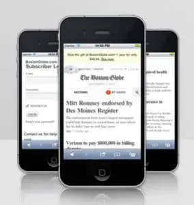
The Boston Globe has the challenge of needing to publish the exact same content to desktop users, tablet users, and smartphone users. They invested a significant amount of time and energy in order to build a single website through which this identical content can be formatted appropriately for each device. If you’re someone at a large newspaper, and you have a significant budget that you’re prepared to invest in a responsive website, this may be a good solution for you. For a typical marketer, a responsive website is not practical, requires throwing out your existing website, and is too expensive.
6) Build a hybrid mobile website
A hybrid mobile website is the best way to build a website for marketers trying to reach the mobile audience because it combines the strengths of several design patterns (custom coded, mobile stylesheets, responsive design) while eliminating their weaknesses.
Hybrid mobile websites provide you with complete creative freedom to design a mobile website that is uniquely tailored to your brand. They enable you to create pages that are custom tailored for the mobile audience with short, succinct content, and images that have been specifically selected and optimized for a mobile display. Content that is frequently updated on your website can also be automatically displayed on your mobile website without the disadvantages of transcoding.
A hybrid mobile website enables you to determine which pages from your website you would like to custom tailored for the mobile audience and which pages should automatically be updated from your desktop website. A hybrid mobile website combines two powerful marketing features: a completely custom look and feel with a robust content management system that’s very easy to use and maintain.
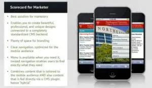 This kind of website does not require any technical skills to maintain. Once the configuration is in place, all changes, updates, and modifications can be completed by someone in a marketing department. The navigation for a hybrid mobile website can be customized specifically for someone who is on a smartphone, enabling you to list only those links that are most important for the mobile user. Location-based links (directions, maps) and touch-to-call phone numbers can easily be prioritized. This kind of website also uses an advanced navigation control that enables people to quickly and easily link directly to the content they are looking for, regardless of whether the mobile website is 15 pages or 150 pages.
Hybrid mobile websites are the best choice for mid-sized organizations and professional marketers. We think it’s the best approach for inbound marketing; that’s why we’re currently in the process of creating our own hybrid mobile website platform.
Subscribe to Our Blog
Join hundreds of people who get free and fresh content every week.


