Recent data shows that there are more people using smartphones to access your website than personal computers. In the next two years, Mobithinking reports that 1 billion people globally access the internet on a mobile device. Additionally, 25% of people in the U.S. have already abandonded their laptops and desktops for mobile computing.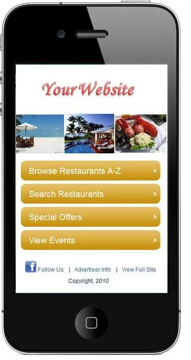
25% of people have already abandoned their laptops to rely exclusively on mobile devices.
This means if your site isn’t working perfectly on a mobile device, there might be a huge group of people who aren’t seeing, hearing and learning about your business when they land on your homepage because it’s too difficult to pass the blink test and redeem lead generating offers.
Follow these 3 steps to a mobile website design
1. Create a Mobile-Friendly Version of Your Website
Start with creating a mobile-friendly version of your website. This allows people who are visiting your website from a mobile device to easily view it on a small(er) screen. Make sure the text is readable the links, that calls-to-action are clickable, and that the unneeded content (siderbars? footer? other?) is removed.
There are 2 ways you can implement a mobile version of your website:
- Mobile CSS: Your web team will need to set this up, but once done, it won’t have to be touched again. Cascading stylesheet (CSS) allows you to change the way your website is organized and displayed on mobile devices of varying sizes. Just as you can have a printer-friendly version of your page, you can also have a mobile-friendly version using CSS to modify the website to “fit” on various devices.
- Mobile Redirect: Or you might choose to develop a wholly new website just for mobile users. If you do this, you will need a mobile redirect so that users who visit your main website oin a mobile device get automatically redirecrted to the mobile version of your site. The disadvantage of this is that you need to maintain 2 websites; the advantage is that your mobile users get a pure mobile version of your site.
2. Setup a meta viewport tag
Smart phone and tablet users rotate their devices to see things in “portrait” or “landscape” orientation, and then use their fingers to scale a page larger or smaller.
The meta viewport tag is what makes all this possible. This small line of code tells a mobile device how to orient a page when it’s loaded. It also determines if a page can be scaled larger or smaller and if it should rotate as users rotate their mobile devices.
Sample meta viewpport tag:
<meta name=”viewport” content=”width=device-width,initial-scale=1,user-scalable=no” />
3. Add Apple icons
Apple icons are a super branding opportunity for people who use Apple mobile devices. This icon allows users to add a quick link to the desktop of their device for easy access.
If your website is lacking the Apple icons, you need to do these two things:
- Design a 57×57 pixel icon that you want for your Apple icon. This could be a screenshot, or a branded button. Of course, upload the icon to your website.
- Add the following LINK element to the header of your website, pointing to the beautiful icon you just created:
<link rel=”apple-touch-icon” href=”/filename.png” />
Mobile device usage is continuing to expand, and marketers are racing to figure out best practices for these new platforms. Implement these three steps, and you’ll be sure that mobile device users can access your website successfully.
Subscribe to Our Blog
Join hundreds of people who get free and fresh content every week.


